Good Enough to Eat
Art, Architecture, & Effects in Cosmonious High
Last blog we talked about the world design and overall direction for Cosmonious High. Today, we want to dive into how we brought that world to life visually.
Let’s talk about outer space again. Remember how we wanted it to be organic, approachable, and safe? How do you convey that visually? We used that question to test our overall art style.
Colors of the Cosmos
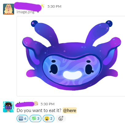
Instead of space being a dark empty void, we focused on turning the skies colorful, starry, and peppered with fun phenomena. We wanted the color palette to be a unique hallmark of Cosmonious High, and our inspirations included oil slicks, neon signs, Hubble Telescope’s images of distant nebulae, and renderings of our own galaxy.
Here’s an excerpt from our style guide:
Overall, focus on bright, saturated colors popping out from deep, saturated colors
Weight CMY over RGB - secondary colors over primary, for more alien feel
Utilize smooth, soft gradients instead of hard transitions
No grayscale! Ever!
Use pastel colors instead of white
Deep saturated blues and purples instead of black
Avoid browns -- too neutral, not spacey

Yes, our style guides are filled with memes
We used the term ‘Vibrant’ for our color direction.
Spacious and Curvaceous
Remember how we wanted Cosmonious High to take place in an organic, optimistic future? The idea of ‘organic’ meant replacing the rigid, angular form-factor of most schools with something curvier— where circles and ovals instead of rectangles are the underlying language.
Getting these spaces to feel right was critical, so we actually brought in some architecture consultants, the amazing You + Pea. They helped us find key inspirations, like Palais Bulles and the Teshima Art Museum. Both have a very clear theme of curves that feels futuristic and organic simultaneously. We tried to ensure we had a similar language in our game across various scales, from the overall building shapes down to common items like doors and doorways:
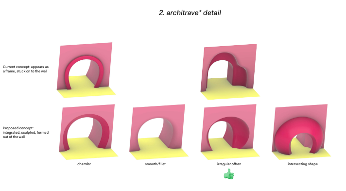
Here’s an example of how we tried to bring the Astralgebra Dome more in line with the rest of the school by referencing other real-world spherical buildings and then ensuring it felt grounded (remember: no one wants to float off into space!).


Toon Times at Cosmonious High
3D stylization in Cosmonious High was largely informed by our prior games. Owlchemy’s style leans “toony” in form, in part because it makes shapes easier to understand at a glance and can emphasize their interactability.
When designing objects in VR, they can’t just look nice, they have to feel nice and have clear affordances for how they’re meant to be used.
Here’s an excerpt from our style guide:
Simplify and exaggerate shapes -- playful believability over realism!
Think “Fisher Price” version of everything
Use tapering and asymmetry to create a more unique and interesting feel
Make things chunky and bold to improve interactions in VR
“My most common piece of art director feedback is, 'Smooth those edges, taper it, and chonk it up!'"
- Carrie Witt, Art Director
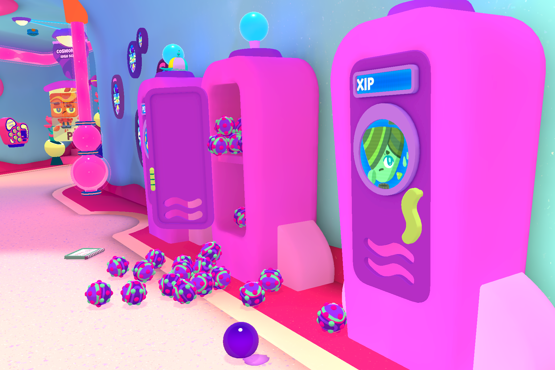
The best example of this is our lockers. Even from the earliest sketches we knew we wanted something curvy, asymmetric, but still immediately recognizable.

We added a few space vibes with the allusion of rocket wings, chunked it up in classic Owlchemy fashion so that there was tons of room for props and toys inside, and voila:
Altogether, our art direction pillars became Vibrant, Organic, and Toony. With this foundation, we wanted to push even further, and looked at how we could use effects to bring everything to life in realtime.
"To make an alien world in space feel fun instead of scary, we need to visually balance familiar & playful with subversive & strange. The art needs to encourage curiosity and exploration and reward the player with delight."
- Carrie Witt
Affective Effects
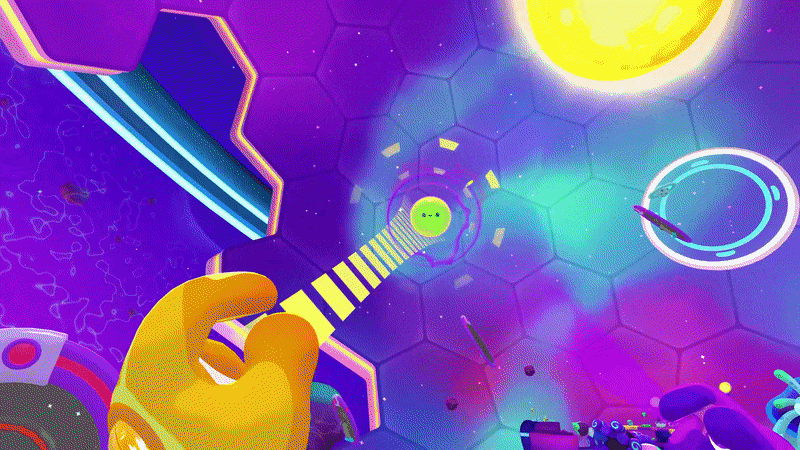
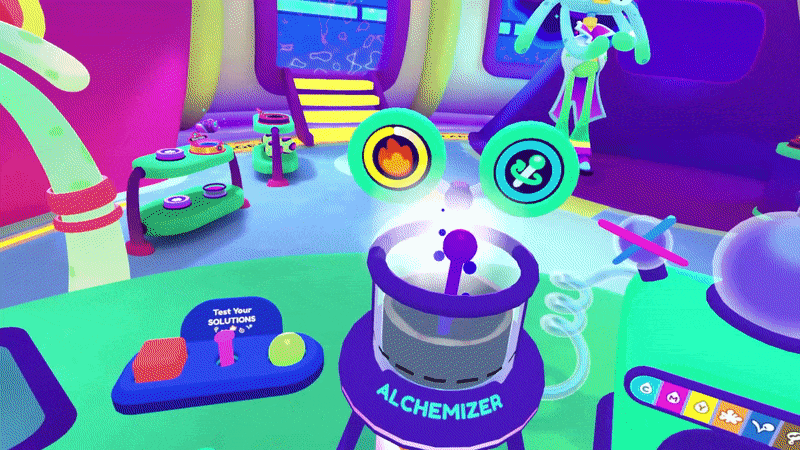
Static art was just the beginning. Our amazing VFX team added organic textures, mesmerizing animation, and delicious responsiveness throughout the game.

Did someone say ‘juicy’?

Little living egg yolks
The more we dug into this art style, the more we realized a consistent throughline arising in our team discussions:
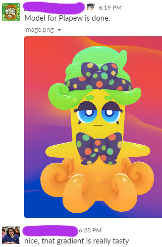


We found one short phrase that embodied everything we wanted out of the Cosmonious High world:
"Good Enough To Eat"
We hope you’ll find Cosmonious High to be a tasty visual treat. For now, here’s a little gif of some forbidden snacks:

See you next time!